Interview with Jeremy Slagle

Interview with Jeremy Slagle

Jeremy, thanks for taking the time to share a bit about your work and story with us. Can you start by telling us how you first got started in illustration/design?

I loved to draw as far back as I can remember. Art was the only subject in school that I excelled at. So, my parents, teachers, youth pastors and other adults would call on me to me to design posters, illustrations, etc. to promote events.

In high school, I was really involved in theater so I would design the Playbill cover along with the posters that would get hung up around the school and the cast tee shirts. I loved seeing my work hung up all over the place and proudly worn by my friends.

I also designed our school mascot. I was amazing to see it used on garments and athletic uniforms. My first job was with a retail the shirt company who hired me because of the work I had done in high school.

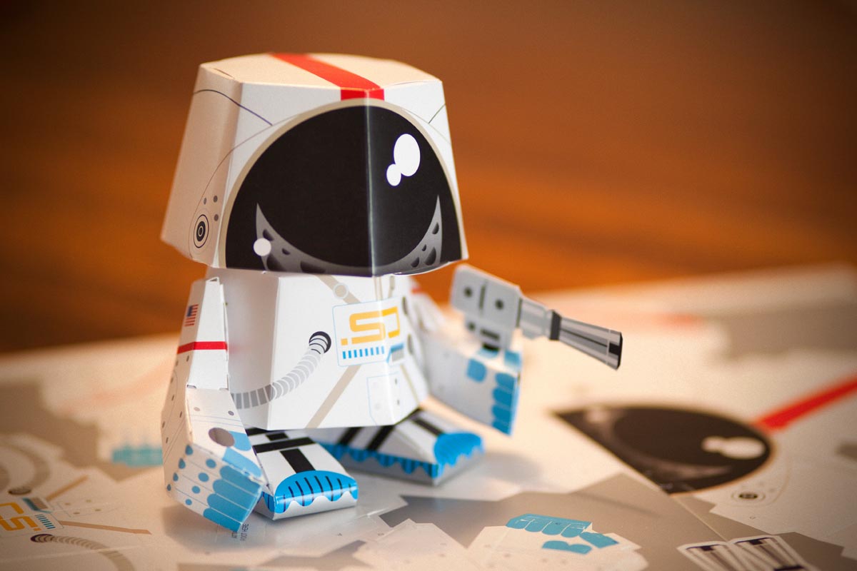
Space Junk paper toy by Jeremy Slagle

You describe your style as geometric, modern and playful. can you share with us how you developed this style?

My parents were really supportive and encouraged me to draw. My mom would come back from the library with all sorts of "how to draw" books.

I loved them all but the ones that I really connected with were by Ed Emberley. His step-by-step books were so easy and fun to follow. It was like watching a Polaroid develop as you added a single line or simple shape to the drawing.

This really implanted in my brain because I approach illustrations the same way today.

I also recall the first time I saw Charlie Harper's work and it resonated with me the same way: simple, geometric shapes that allow the brain to fill in the gaps. This style reflects, not only in my illustrations but in my logo designs as well.

Salon Spaces by Jeremy Slagle

Many designers and illustrators struggle to find their style. What's your best advice to help other designers find their style?

Don't go searching. Just do what comes naturally.

I know that sounds easier said than done, but if you need a jump start, make Pinterest boards of the stuff that resonates with you when you see it: fonts, colors, patterns, badges, illustrations, photography, collected pieces that bring you joy.

Learn from them, mash them up, and make them your own. Sometimes you have to travel and get our to your studio or the place you sit down to work. I call it an "out of studio experience."

You need to be able to look past your default and see yourself like others see you and reflect back on your own work to see what's working and where you can improve.

Staying in your studio only allows you to be inspired by what's right in front of you and you.

On a business trip, book and extra day or two and walk the new city with a camera and sketchbook. Keep track of new things. Jot them down. Sketch thumbnails. Take photos. It all adds up to what makes you...you.

Black Radish branding by Jeremy Slagle

What's one tool that you couldn't live without and why?

Moleskine sketchbooks. They don't fall apart, they are the perfect size to take anywhere. The batteries don't drain, and you don't need a wi-fi hotspot to use it.

You mentioned that your favorite piece of software to work in is Illustrator. What makes this your favorite piece of software?

I love working in vector format and I create a lot of logos and custom type. I also love the ability to use texture and grain to add little bit of "analog" to the work. Custom Illustrator brushes and the use of transparency masks are awesome for this.

Chin Up, Chinchilla book. Illustrated by Jeremy Slagle.

You mentioned your favorite RetroSupply products include Drunk Sailor, Wax & Oil, and Vector Fuzz brushes. Can you share what you like most about it?

While I love the ability to create simple shapes with the ellipse and rectangle tools, flowing curves with the bezier tool, and straight lines with the line tool, the resulting shapes can be pretty boring and flat. They often look too clean and lack the whimsy and character I wish they had.

The ability to add dimension with "analog" tools to add shades and highlights, roughen the edges and change a straight line into something that looks hand drawn can really bring an otherwise flat illustration to life.

Utilizing the variable width tool on a brush stroke allows me to get even more specific by tapering and customizing the brushes to look even more dynamic.

Grab VectorFuzz Now

Jeremy uses VectorFuzz brushes in his illustration work to add analog texture. Grab the brushes now for just $19.

Our readers love to hear about specific techniques that great illustrators and designers use. Can you share one of your favorite techniques?

I ALWAYS solve design problems in my sketchbook before designing in Illustrator. Our brains tell us that computers make things faster and more efficient, but when it comes to purely concepting, nothing beats my Moleskine journal, Pentel GraphGear 1000 mechanical pencil and a .03 Micron pen (your preferred tools may very).

Half the time I reach for my iPad pro, it's low on battery or the Pencil has to be recharged. Time and time again I come back to paper and pencil. They never fail me.

Once I have worked through several pages of sketches, I circle the options that are working and refine them as far as I can. Next, I'll scan the pages and drop the finals into a separate layer in Illustrator, fill it cyan and set the opacity to 15% and create my final work on top.

Often times, I'll work outside the studio and intentionally leave my laptop behind so I'm not tempted to go to the computer too early. What's done with pencil on paper is the most important part of the process and if you jump in too soon, you'll shortcut the big idea in favor of "getting it done." I speak from personal experience.

You've included a few pieces of your favorite work. Can you share a little bit about each piece?

Columbus Brewing Company bottle design by Jeremy Slagle

Columbus Brewing Company Bock Packaging

I loved the opportunity to do this symmetrical wraparound concept for CBC. The word "bock" means "goat" in German and it seemed to make sense. Adding some found and created textures helped to balance the otherwise clean and modern shapes.

Wooly Pig Farm Brewery package design by Jeremy Slagle

Wooly Pig Farm Brewery

The owners of Wooly Pig Farm Brewery are inspired by the people who took care of their land before they got there. Amish hex symbols were the key inspiration for the brand. The brewery was named after the free-range Mangalitsa pigs that share the brewery's property and benefit from the nutrient-rich, spent-grain from the brewing process.

Amazon Sloth t-shirt design by Jeremy Slagle

Amazon Sloth

This fun illustration was created for a tee shirt retailer that gives a portion of their profit to environmental causes. I was asked contribute to a series of endangered Amazon animals and was lucky enough to be able to draw the cutest one! I really love that I didn't have to draw the bamboo he's hanging from. By leaving the spaces blank and adding a few leaves, the viewer gets the idea.

Luna Burger design by Jeremy Sagle

Luna Burger Kick-Start Breakfast Patties

I had the opportunity to create the entire brand and packaging for this client. After visiting the local Whole Foods, the client agreed with me that there was no point in creating another veggie burger box with a plated and photoshopped picture like everyone else's. They allowed me to take a risk, and instead, use illustrations to focus on the plant-based ingredients they were so proud of.

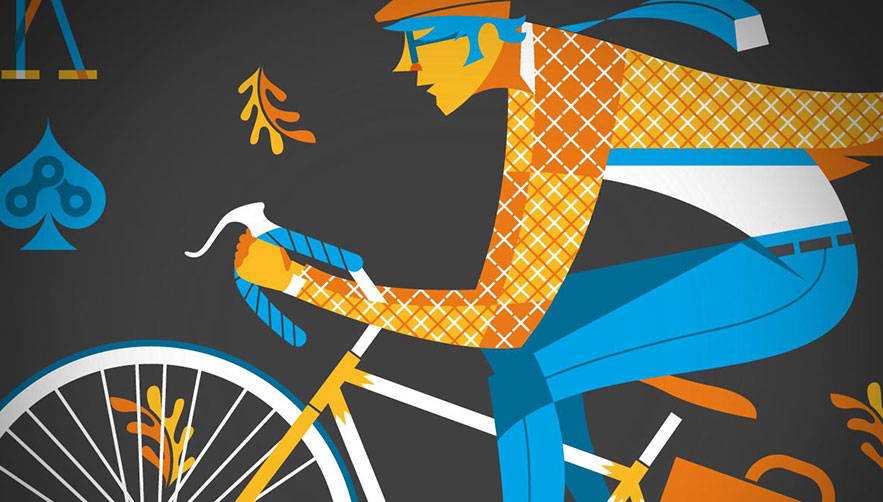
King and Queen of the Road posters designed by Jeremy Sagle

King and Queen of the Road Posters

These were created for an Ohio-based bicycle-themed poster show called Pinchflat. The screen-printed posters can be hung in any orientation. Cyclist come in many different forms: the casual rider, the commuter, the messenger and the daily driver. All of them are worthwhile reasons to keep the car in the garage and set out on an open-air adventure.

Wooly Pig Farm Brewery branding by Jeremy Slagle

What advice would you give to other designers and illustrators to help them stand out in such a crowded field?

Don't chase the trends. It's okay to be inspired by other's work, but don't copy it. Instagram is full of knockoffs. The ones that get noticed are doing something truly unique.

What advice would you give to other designers and illustrators to get more work?

Do good work and share it with the world. It takes time and intentionality.

Spend your social media currency wisely and avoid topics and conversions that divide rather than build community ... no matter what your opinion happens to be. Save those conversations/debates for coffee or over a beer.

You'll find that, when you talk in person, there's a lot more in common than you realize and you may even change your mind.

People get to know you by what you put out in the world. If it's good, if it's beautiful, if it's lovely, and promotes healing and community, that's how you'll be seen.

If you promote division, violence, anger and have a tendency to pick a fight, good luck getting hired. What you put out into the world defines how the world sees you.

Thanks, Jeremy, for taking the time to share a little bit about your story and work. Anything else you'd like to share with us?

Do what you are designed to do. Do it to the best of your ability and only do it if it brings joy to you and others.

Resist the urge to get bogged down in "movements." Be your own force for good in the world. We were designed to create. Go create something awesome!

About the Designer

Jeremy Slagle is the owner of Slagle Design, a three person and one dog design firm located in Columbus, Ohio. Jeremy lives with his wife, two children, and dog Scout. You can follow him on Facebook, Twitter, Instagram, Dribbble and LinkedIn.